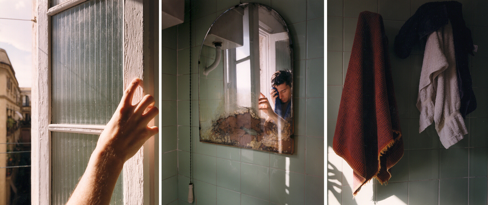
Andreu 1997
DAVID HILLIARD - CONTEMPORARY ARTIST MODEL
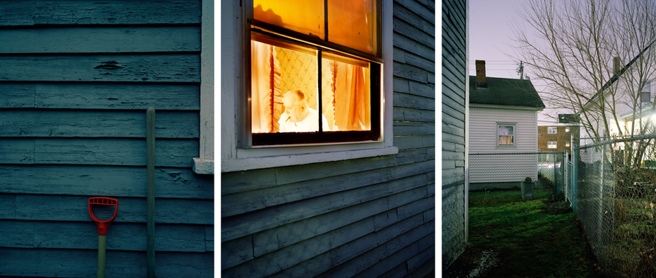
Dad 1998
SUBJECT MATTER/CONTENT
Subject Matter / Content
David Hilliard series of works created between 1993 and 2000 all have the same method of work. Hilliard creates photographs which capture a false representation of a panoramic feel. When viewed closely it is clear that the images are not taken from one photo. All three photos (sometimes two) are different photos taken at different angles. But they way that Hilliard combines the images together skillfully and well thought, helps to create an illusion between the artwork and the viewer.
In the second photo titled Dad which i have chosen to analyse, Hilliard creates a panoramic illusion. The first image is taken front on, yet the middle image is taken, angled to the right. This creates the illusion that the image is of the corner of a house. But when you look closely you realize that half the window pane from the second photo is in the first. And it is impossible for an old house to have window panes connecting around the corner. If this statement is true it could be believed that the two photographs are taken at a different times of the day. This is evident to the shadow located at the bottom of the middle photograph which is not apparent in the first photo. The main subject matter would be the father in the foreground of the whole photograph, sitting inside the house illuminated by the inside lights. However this is only so because of the window that has framed the man. The shovel and wooden handel help to set the scene of what i would expect is a retired man, that spends his days gardening. However the wire fence that barricades him and other houses seen further down the street suggest that he is not the richest of men and may not have all the material objects one could wish for. And therefore can spend his days pouring his time and creativity into his gardens. I feel that maybe because he his old, society has locked him away behind this fence where they don't have to pay further attention to him. This is not something that you would see in New Zealand and as the building the father is seated in and the buildings that can be seen in the background look rather weathered and old, i may assume that this series of photographs have been taken in either Europe or even America as these countries have been around a long time and have been able to establish these old houses.
COMPOSITION
Each photogrpah has been structured similarly yet differently. The white lines that seperate each photograph help to frame the focal point of the image, being the window and what is inside. However, i feel like it is not as important to know what is inside but what is on the outside as that is where there is more story to be told. The weatherboards on the middle photo help lead towards the other houses down the street and the large building shown in the background. The lines from the wire fence also help to draw our eye to this. It helps to create the sense that this is just one of many old houses, lined up along this street. The first photo on the left hand side does not link with the grid lines of the other two photos, which lines do work together quite well, however i feel like this is necessary as it would not look as visually appealing as it does if the photo was a continuous glance down the road. There is a clear crisp focus on the spade handle yet i feel that this isn't that important for the photograph personally. I don't believe that Hilliard would have needed to crop much from the photos as the photos are a similar portrait length to when first taking a photo. He may however have zoomed into most of the photos to get perspective and know what he wanted the subject matter to look like. zooming into photos helps to create depth of field i find sometimes. It helps you to see what you can focus on and what you don't need to focus on. Th last photo on the right is focused on the white house showing a middle range of depth of field. I like how the photo has many different view points, from direct close up to angled to the right and then the last photo being a long distance away. It creates something that is visually appealing to the viewer.
PHOTOGRAPHIC CONVENTIONS
I believe that there was a large photo format used to create the photo as the photos are a nice crisp quality. Every detail is visible and does not hide away at all. Like previously said, i belive that the photo hasn't been cropped and if it has, only a little as the photo is the same size as a portrait size photo. i believe that there has been different lighting used for the the left hand photo and the other two photos. The last two photos i believe would have been lit by artificial lighting, although taken at night time it is disguised by the bright fluorescent lights that line the building seen across the street. This will also be able to create the shadows the wire fence has left on the side of the house. There is no shadow on the left photo yet the photo is very bright and colourful. The blues of the house between the two photos a[[ear to be a slightly different tone, and this i could assume through the different lighting that was used. I strongly believe that the left hand photo was taken at a separate time as the other photo, and this is possible that he still could have done so in the same shoot as the sky looks like the sun has just set. Therefore, in the space of half an house he could have had perfect lighting to cast no shadows onto the wall and light it so that it was a crisp quality photo. However he could have placed a light that may not have been as bright as the photo beside it, on an angle that would not have affected the shadows from the fence. The photos are sharp and clear meaning he probably took the photos using a tripod to make sure that the photos were perfect yet a low shutter speed to make sure he could get the haze of the lights. If shot with a high shutter speed the blurr of the lights would not have appeared and i can say that i would not enjoy the photo more. I believe that because of the digital age, i can easily assume that the photo has been manipulated with the vibrancy of the photos. The blue on the side of the house is an evident example, as i dont know many houses that are painted in such a vibrant colour. It also appears to be weather so i do not believe that the colour would have lasted in vibrancy for so long. It is easy to manipulate the photos and done so by photoshop or even camera raw. Obviously a high tech printer was used to print this photo, if it has been printed. I can imagine that it would be printed on a large scale, and if i was hilliard i would do so. But therefore i would need a good printer and most probably a large one. The photo is easily interpreted by itself as it gives enough information through subject matter to assume what could be the story behind the man.
WORKING METHODS
I think Hilliard is quite interested in society and the showing people the unseen stories. The stories behind the people, one that has been unheard. However, he does not want to give away the whole story of a character otherwise there would be nothing to interpret and therefore it would lose its appeal to a viewer. although titled Dad, i am not certain that the man in the photo is his father. But even so you can feel a compassion to tell this story of this man to an audience. I think the photo make as re asses the things that we have and the things that we can be happy and thankful for and i believe that this is always a good sign when people feel that way. It creates a connection between the work and the viewer. This image doesn't bring forward concerning issues or sad images from war, but there is something about the photo that you feel you need to feel sorry for the man, and maybe that is why Hilliard published it. To let people be thankful for what they have and stop asking for what they don't have.
PERSONAL RESPONSE
I like the way this image has been constructed and how it plays on the eyes. It is not just a standard photo and this is what helps to make the image more interesting. He hasnt just stuck three images together either he has made a photograph that shows different angles and this helps to make the images more interesting. I don't see the image as important, as i view it as just art and not something that cna change peoples whole views or way of life. On the outside it appears a pretty photo, and on the inside i dont feel it evolves much.
